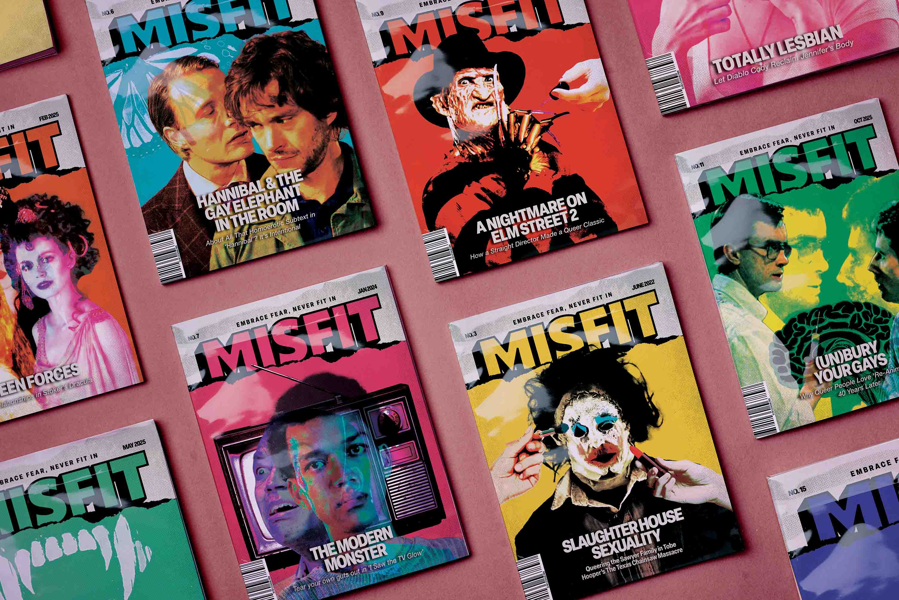
Misfit magazine is all about the culture around queerness and horror, and the overlap between these two. While the main focus is a magazine for the culture, it does not forget about the design as the looks matter as much as the content for this magazine.
Logo
CoversI
nterior spreads
Photoshop
Indesign
Illustrator
Colorful
Rough
Edgy
Bright
.jpg)

.png)
While there are plenty of pop culture magazines, that also focus on queer stories, the market for horror magazines is much smaller and narrow. As an avid collector of magazines I noticed there is a lack of design centered horror magazines, specially without the stereotypical red and black colors, and there is a lack of pop culture and queer magazines with a edgier look, finding there the perfect opportunity to create misfit.
.gif)
Being a magazine that strays aways from stereotypes, I wanted it to have a not-so-conventional look to it, by having rough textures and harsh photography. For the photography I focused on the queer aspect of the magazine by having queer themes on the images, with the editing I added the horror aspect of it by having harsh textures and contrasts.
.png)
.png)
.png)
.png)
.png)
.png)
.png)
.jpg)